Adaptive vs responsive web design
You may have heard of terms like “adaptive website” or “responsive web design”, but what does it really mean? What is the difference between adaptive and responsive web design? And between adaptive vs responsive web design, which one should you choose?
A bit of history of web development
Before smartphones started gaining popularity and before people started using them for browsing websites, there was no need to think about how your website would look on different devices. Most developers didn’t think about how websites would look even on different browsers. Horizontal scroll and broken text was something we were all used to seeing on web pages. Reason for this was that a lot of front-end web development was done by using table layouts.
Then things changed. Monitor manufacturers began producing bigger and bigger screens and monitors with different width-height ratio. People discovered that they can use browsers on their phones and the trends changed. The need for having a website that would show correctly to all users became important to website owners. Some developers started creating different website versions that would be served to mobile users, some started slaughtering design by eliminating page elements, while others just didn’t care enough.
Enter the adaptive web design
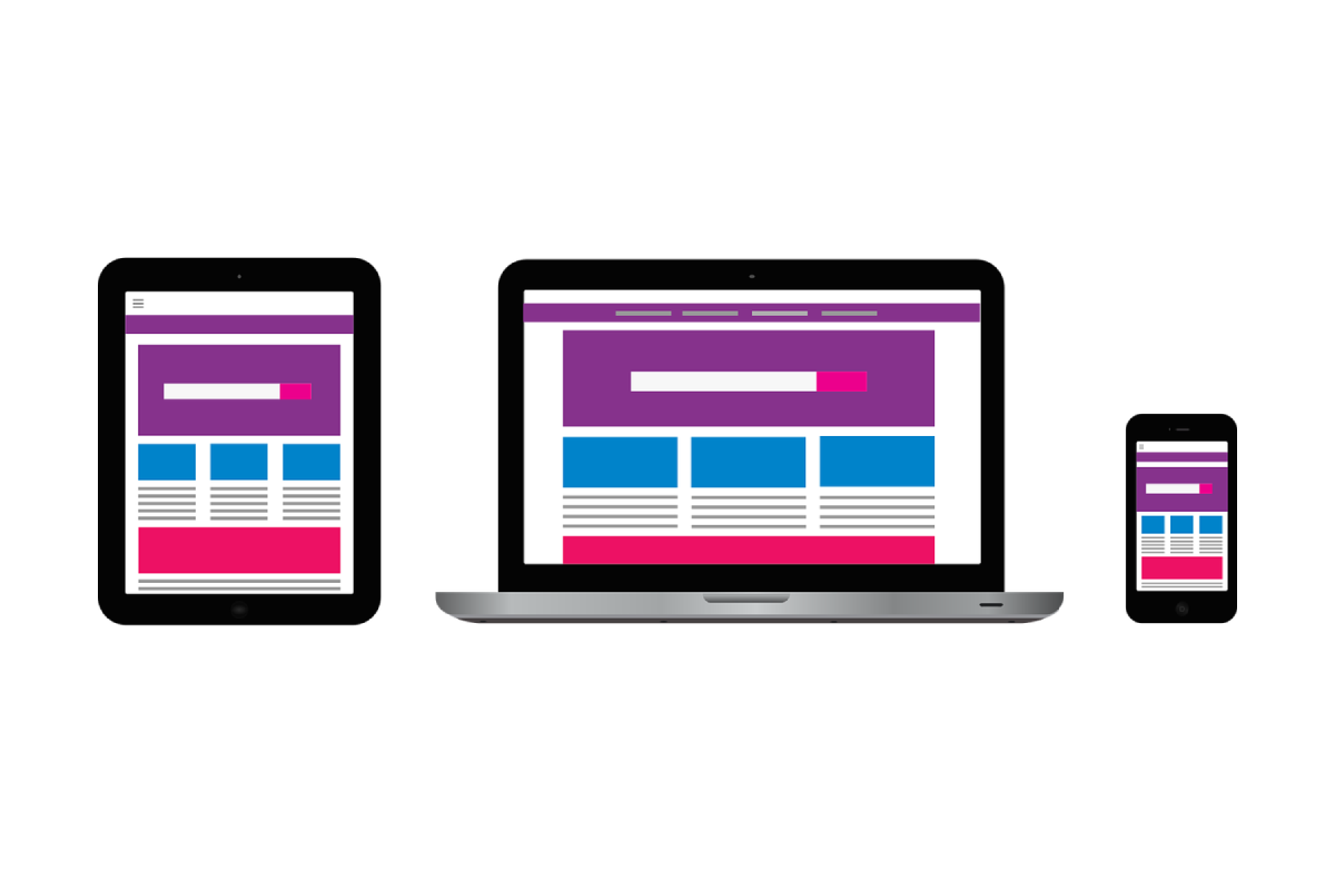
At that time, web designers started producing designs in several versions, usually one for desktop, one for tablet and one for mobile. Development of adaptive websites (which started in 2011) is based on fixed layout designs by usually using media queries to define breakpoints which refer to different design versions. For these breakpoints (usually meaning predefined screen widths) websites looked and functioned as planned. Good adaptive websites included support for as many devices and screen sizes as possible.
When having adaptive website is just not enough
The problem came for users that didn’t use “standard” screen sizes, or when they wanted to resize their browser windows. In these cases, images would be stretched or shrunk, page width would be wider than browser itself which would result in having horizontal scroll, elements would be shifted in the next row and unaligned, text would be wrapped in an abnormal manner, or even have words broken… This was also a problem before CSS3 was fully supported by browsers. Developers who wanted to cover as many screen/window sizes as possible had to rely heavily on use of JavaScript.
calc() to the rescue
With viewport units (vw, vh, vmin, vmax) and calc() function, true responsive web design (RWD) became possible. Developers no longer have to define static dimensions or use JavaScript to calculate them. Now they were able to let browsers dynamically calculate element widths and heights. By properly combining standard and viewport units with calc(), developers are able to eliminate a lot of code from media queries. The result of a fully-responsive website is pixel-perfect implementation. This means regardless of screen or window size (either on mobile devices or by resizing browser windows to non-standard dimensions), user experience would always be perfect.
What now
Most web agencies concentrate on delivering fast solutions. A lot of them achieve this spending less time on development. When presented the choice “adaptive vs responsive web design” most of them end up by developing just adaptive websites. Their QA process (one that comes between development and release) includes testing for a small number of most popular screen sizes, browsers and devices. A lot of clients aren’t able to tell the difference between adaptive and responsive, since they rely solely on agency’s QA, but if you want user experience on your website to be perfect, you mustn’t agree to less than a pixel-perfect website. Easiest way to test if your website is responsive or just adaptive is to watch how pages and elements on them behave by resizing the browser window.
But why is responsive web design important?
Since 2015, Google has been rewarding websites that are mobile-friendly by ranking them higher. In the coming years this reward for websites turned into a penalty for those who didn’t follow their recommendation. This means that if your website isn’t mobile-friendly, you have a huge SEO issue.